
Lose It!
Design direction for a fifteen-year-old app that has to keep feeling new.
-
Lose It! is one of the longest-running food trackers on iOS and Android — 57 million users, 150 million pounds lost, 4.8 stars across 776K ratings — and the same codebase powers Cleveland Clinic Diet and the Challenges app. I lead design for the group: UX, UI, brand, marketing creative, and the design system underneath all of it.
-
Design Director since March 2025, promoted from Principal Senior Designer. Two reports: Silu Manandhar (UX design, iOS lead — design system and Themes) and Adam Moss (UX design, Android lead). Both grew into those platform-lead roles on this team. I direct the work and still carry a design load myself.
-
57M+ users · 150M+ pounds lost · 4.8★ iOS (776K ratings) · 4.6★ Android. The Voice Logging launch was picked up by CNN Health; the Challenges app shipped an exclusive collaboration with Apple.
The Challenge
A fifteen-year-old tracker, on two operating systems that redesign themselves underneath it, used every day by people whose habits break the moment something feels unfamiliar.
Apple and Google keep getting more polished and more prescriptive — Liquid Glass, Material 3, patterns that arrive with strong opinions attached. Follow them exactly and the app dissolves into the operating system. Ignore them and it reads as old. Neither is survivable for a product people open every single day.
Native is a moving target. A brand is what survives the move.
Timeline
GLP-1 medication logging
Purchasing overhaul in RevenueCat
2026
Liquid Glass & Material 3 reskin
Design system rebuild
Lose It! Themes feature
Onboarding redesign
Search feature
2025
AI logging features
2024
Courses feature
2023
The Design Pillars
Design to the mental model
iOS and Android users don't just expect different visuals. They expect different logic — where things live, what a gesture promises, what a button will do next. Build to each platform's mental model and the app feels obvious. Copy one to the other and it feels wrong in a way people can't name, and they leave without telling you why.
Adopt without dissolving
A system update is an invitation, not an order. Take the parts that make the app feel current; keep the parts that make it feel like Lose It! If someone can't tell our app from the operating system, we've given away the thing they chose.
Cutting is designing
Three designers, four apps, a roadmap that only grows. Deciding what not to build is the highest-leverage work I do. Prioritizing means removing things from scope out loud, with a reason — so the team knows what we're protecting and why.
Part 01 — Making design a revenue team.
Overview
The highest-leverage thing I’ve done as a manager. We moved subscriptions onto RevenueCat so my designers could A/B test paywalls without an engineering ticket — no feature work, no release cycle, just the offer.
Four things we learned about our users:
They love a sale, and the discount needs room. A percentage treated as a badge underperforms. A percentage treated as the headline works.
Minimalism converts. Anything competing with the price is arguing against it.
A returning user is not a new user. Reactivated and brand-new users behaved so differently that treating them as one audience was quietly costing us.
Naming the feature beats selling the app. A paywall for one specific feature outperformed the generic offer — people buy a thing, not a subscription.
Tradeoff
Most challengers lost, and the winners won single digits. But this is the cheapest revenue in the product — a paywall test moves the number without a sprint of engineering — and the paywall had to leave the old brand regardless. Running it as experiments rather than a redesign left two designers able to build and ship their own tests. Design stopped being a cost line.
The Result
Two of them made money: +11% revenue on remove-ads, +6% for feature-specific over generic.
Those are the numbers I can point at. The one I’d argue matters more is that two designers stepped into the PM and marketer seat: they choose what to test, write the hypothesis, read the result and decide what ships next. And it has no ending, which is the point. A paywall program isn’t a project that closes — every winner becomes the next control, and the +11% screen is already being argued with. It’s still running.
Part 02 — GLP-1 Support and telling people when it wears off.
Overview
GLP-1 changed who opens a food tracker and why. Back in May 2026, competitors already had medication logging and our members were already on the drugs — so parity wasn’t worth shipping.
We built a curve, not a log. Everyone else records the date of a dose. We model the concentration between them: rising, near peak, declining, and roughly when the effect wears off. Multiple medications, and the same phase language on the log, the dashboard and the full history.
Tradeoff
One complex feature, iOS and Android in parallel. Symptom tracking, AI analysis, animation and custom iconography all left scope. What survived is the part nobody else had.
Designed by Silu Manandhar. I directed, scoped, and defended the cuts.
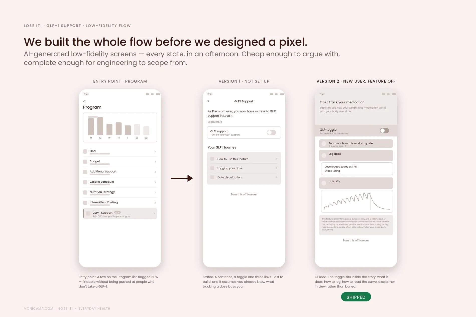
We generated the whole flow as AI-built low-fidelity screens — and stayed there. Grey boxes are cheap enough to argue with and complete enough for engineering to scope from. Version 1 stated the feature. Version 2 put the toggle inside the story, with the disclaimer in view. Version 2 shipped. It’s now how the team starts.
Design didn’t stop at the feature. We produced the whole launch set from the same five screens: blog banners and article assets, the App Store feature card above, and Play Store assets — so the thing people saw before they downloaded it matched the thing they got.
The Result
Shipping GLP-1 Support raised the value of Premium — and we've seen a continuous increase in conversions since.
The feature sits behind the paywall, so the value went straight into the tier: someone on a GLP-1 now has a reason to subscribe that a free tracker can't match. But the part I keep re-reading is the reviews. "I love this app and was excited to see they added GLP-1 tracking" (Google Play, 4★). People are finding it on their own in GLP-1 communities and recommending it to each other, unprompted, in threads about which app to use.
Part 03 — “Does this feel like Lose It!?”
Overview
Both platforms changed their foundations in the same month, and we had to move with them. Google announced Material 3 Expressive in May 2025; Apple announced its new software design in June. Our system couldn't follow — components had drifted, tokens disagreed on color, spacing and type, and iOS and Android had quietly become two different products. A full reskin: both platforms, light and dark.
The constraint is what made it hard. Lose It! has been in the App Store since 2008 and the log screen is still the log screen. Whatever we shipped had to align to Apple and Google and stay recognizable to people who have used this app for seventeen years.
Tradeoff
Following the platform all the way would have made us more native and less recognizable. We kept a saturated brand header neither Apple nor Google would have drawn for us, and holding parity across both platforms ruled out Material You's dynamic color — the most expressive thing Google shipped that year. I chose recognizable. A customer told us what that was worth in 2014, and it is still the cheapest research this team owns.
Liquid Glass wanted translucency, restraint, chrome that gets out of the way. So we asked it honestly: what would Lose It! look like if we simplified it that far? The answer was — like every other app. We wrote down what the brand is and isn’t before anyone drew anything.
Lose It! is
Warm and welcoming. Energizing — confidently orange. Clear and structured.
Lose It! is not
Sterile or clinical. Muted or washed out. Distracting.
Android asked the same question, louder — Material 3 Expressive wanted the header to dissolve into the user’s system theme. So we tested how much of it we actually needed: orange on every screen, orange nowhere, and orange only on the screen people live in.
Research settled it: people recognize this app by its orange before they read the name. So the header stayed. What changed was the value — #ED7200, darker and more accessible than what we had, with its own Pantone, a ten-step ramp and Material 3 roles, so one number now drives the header, the CTAs and the nav on both platforms.
The quiet win: the system underneath
None of it is affordable on a drifted library. The old color system named things by where they appeared — TabBarSelected, HeaderText — so every new surface meant a new name and a new argument. The new one names them by what they mean, and engineering builds from the same table we design from.
Silu Manandhar owns the iOS system, rebuilt on Figma variables from primitive to semantic. Directed — I set the criteria, chose what we would not do, and defended the scope.
The Result
People keep writing in about it. Reviews and notes have kept coming since the update, the numbers have gone up across the board, and the thing users say most is that it still feels like the app they have been using for years. Which was the whole brief.
Part 04 — Twenty-eight identities, one component set
Overview
In 2026 people expect a product to feel like theirs — personal, expressive, adaptable, not one-size-fits-all. Themes let Lose It! support moods, seasons and motivations so that opening the app every morning feels fresher and more human. They are also the clearest proof the new system paid for itself: once color lives in semantic tokens, a theme is a data change rather than a build.
28 themes shipped across iOS, iPadOS and Android — Space, Under the Sea, Lemon, Music, Thanksgiving, Pride, Hanukkah, International Women’s Day and the rest — each in light and dark.
Tradeoff
A theme is beautiful for a week, and then you have to read your calories in it every morning for a year. So expression is deliberately fenced: it lives in the header art, the accents, the action buttons and the nav, and it stops at the numbers. That rules out the fully immersive themes people ask for — the ones where everything is tinted. I chose legible.
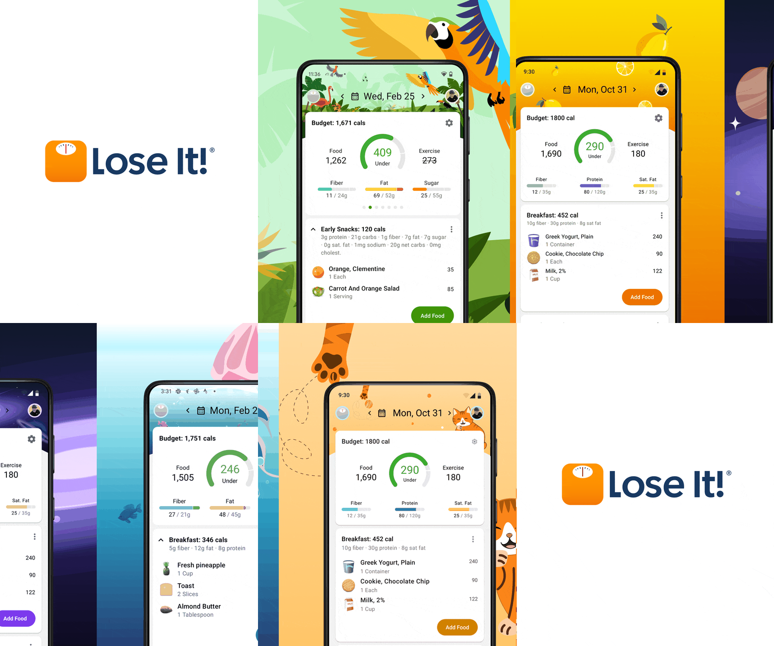
Android — Jungle, Lemon and Under the Sea, same screen, same components.
How we got there
We started by taking one theme apart. Before redesigning any of them, we audited what was actually broken — flat fills with no zone logic, low-contrast buttons, illegible labels, an illustration sitting where a tab should be — and wrote the rule for each one.
Protected data zones are what came out of it. The numbers keep their contrast and their palette no matter what is switched on; everything outside that zone is free to change. Accessibility was designed in from the first theme rather than audited at the end, and the cultural themes were researched, not guessed.
Eight weeks, two designers plus a PM and both platforms. Directed — Silu Manandhar led the visual design, the theme system and accessibility.
The Result
Theme usage is up more than 7% on both platforms — and the list of favorites rearranged itself.
The themes people pick now are not the ones we would have predicted, which is the useful part. Personalization stopped being a setting nobody found and became something people choose on purpose — and a real reason to stay on Premium.
What this project led to
Four years in, I’m still at Ziff Davis and still glad to be. Health is the part I can’t fake enthusiasm about — designing for people trying to change something hard about their own lives gives the work a sense of mission that a growth target never could. Outside the product, I’m one of the leads on our Sustainability Committee, helping set its direction; it’s where design thinking travels furthest from the app. And the people here are funny, all of them. No wonder life eventually brought me to comedy and improv.