
DailyOM
Design direction for a twenty-year-old wellness brand's move to mobile.
-
DailyOM has guided personal growth online since 2004. It has 3.5 million subscribers and 375+ courses from 250+ instructors, covering everything from emotional health to spirituality. In 2025 I led design direction for its redesigned iOS and Android apps. The work was translating the newly relaunched website into two native mobile experiences and introducing DailyOM Plus, a monthly subscription to the full course library. -
Design Director. I own the direction, the mobile visual system, and the subscription experience. Product: Taylor Smyrnos. Design: Adam Moss, Android. Brand partner: Todd Zander, Product Director at DailyOM. Engineering: the Everyday Health team.
-
Shipped the MVP on iOS and Android. It puts 240+ courses in one native library, with personalized recommendations, bookmarks, and progress tracking.
The Challenge
Two teams, one app, and no shared playbook.
DailyOM is a web company with no mobile engineering team, so the app was built by ours. That meant two teams working on different schedules, in different time zones, with different processes and different paces, all trying to ship one product. On top of that, the platform hosting DailyOM's courses came with technical constraints the app had to design around.
So a big part of the job was keeping everyone in sync. Our PMs and designers became the bridge: regular updates, shared documentation, and decisions written down so they didn't have to be made twice. When the course platform limited what we could build, we designed with those limits instead of fighting them.
Most of the hard work on this project happened between the teams, not on the screens.
The Design Pillars
Unmistakably DailyOM
The app had to feel like the newly relaunched website from the first screen. It uses the same warm backgrounds, course cards and imagery, with the brand palette adapted for mobile.
Native on both phones
The app follows Apple's HIG on iOS and Material 3 on Android, with SF Pro and Roboto, and supports light and dark mode. The brand sets the look, and each platform sets the structure.
Made for longtime members
Web purchases carry over into the app. Onboarding asks what you want to grow in. The paywall appears only when you open a lesson, which is when you're most ready to commit.
Overview
Before designing a single screen, we got to know two things: the person we were designing for, and the brand she already trusts.
First stop, the persona. DailyOM’s existing research gave us Suzanne. She’s 51, an HR director with grown kids, and she’s moving from caregiving to self-care. She already buys courses on the web and wants a deeper, everyday connection on her phone. Everything in the MVP was built for her.
Then, the brand itself. DailyOM is a holistic wellness brand, a place for mind, body and spirit rather than a single practice. Its 375+ courses run from fitness and body self-care to emotional health, relationships, and spiritual and metaphysical topics. The voice is nurturing and trusted, closer to a mentor than a fitness coach, and that’s why members stay for years.
We went through the newly relaunched website piece by piece: colors, typography and components. For each one, we decided what carries over to the app and what hands off to the platform.
Part 01 — Brand & Persona.
Tradeoff
Quincy is the most recognizable piece of DailyOM’s look, and we left it on the website. Custom fonts in a native app add load time, take extra work to scale with system text sizes, and never feel quite native on iOS or Android. Readability was the priority, especially for an audience aged 45 to 65, so the app uses SF Pro and Roboto and lets color, imagery and the course cards carry the brand instead. It still feels like DailyOM. It just reads like a phone.
Color
We adapted DailyOM’s web palette of mauve, teal and warm greys into two native systems. On iOS, brand accents sit on Apple’s system greys. On Android, they map to Material 3 roles. Both work in light and dark mode.
Typography
Quincy and Inter stay on the website. The app uses SF Pro on iOS and Roboto on Android, for better performance and readability.
Components
Course cards carry the brand and translate directly from the web. Filters, search and settings use native components, so the app feels at home on every phone.
Competitive audit
Early on, we studied direct and adjacent apps, from MasterClass and Calm to Fitness+, TED and Apple’s own apps, for onboarding, browsing and subscription patterns. We took one move from each and left the rest.
Overview
The hardest UX work wasn’t structure. It was bringing the brand into the app. So much of DailyOM lives in its nature photography, and the most branded moments (the splash screen, onboarding and subscription) took the longest to explore.
Brand or system, one decision at a time. Some screens lean into DailyOM’s imagery and trade away a little of the platform’s defaults. Others follow iOS and Android closely and let the brand step back. Each section below shows which way we went, and why.
Part 02 — UX Decisions.
Tradeoff
Nature photography is DailyOM’s signature, and the splash screen is the one place everyone sees. We gave it up there. Photos under white text were hard to read, orange skies carried the wrong weight that season, and every scene asked the eye to work before the app even opened. Calm and contrast won over brand recognition: soft abstract shapes, dark text and a three-word tagline. The nature photography didn’t disappear. It moved into onboarding and the courses, where it has room to breathe.
Splash screen
We started with a sunrise. Warm, hopeful and very DailyOM. Then the LA fires hit California, and a screen full of orange sky no longer felt like calm. We moved away from that palette and went through more than 20 explorations: night skies, forests, mountain lakes and more. The winner was the least literal option: soft abstract shapes in DailyOM’s taupe with dark text. We also cut the tagline from “Redefine Holistic Wellness, Reimagine Your Life” to three words: Grow. Shape. Heal. It felt the calmest, and it was the most accessible of everything we tried.
Onboarding
We designed for two people arriving at the same door: someone who has never heard of DailyOM, and someone who has been taking its courses on the web for years.
New to DailyOM. A mini onboarding: a warm welcome, then four quick questions about what she wants to improve, what gets in the way, how DailyOM can support her and how often she wants time for self-care. A reminder opt-in and account creation close the flow, so the app starts from what she told us.
Already a web member. No questionnaire. She logs in, sees a short “Everything you love, now even better” screen, sets reminders and lands in My Courses, where her web purchases wait in their own section. A longtime member’s first worry is whether the courses she paid for came with her. The answer is on the first screen she sees.
Purchasing
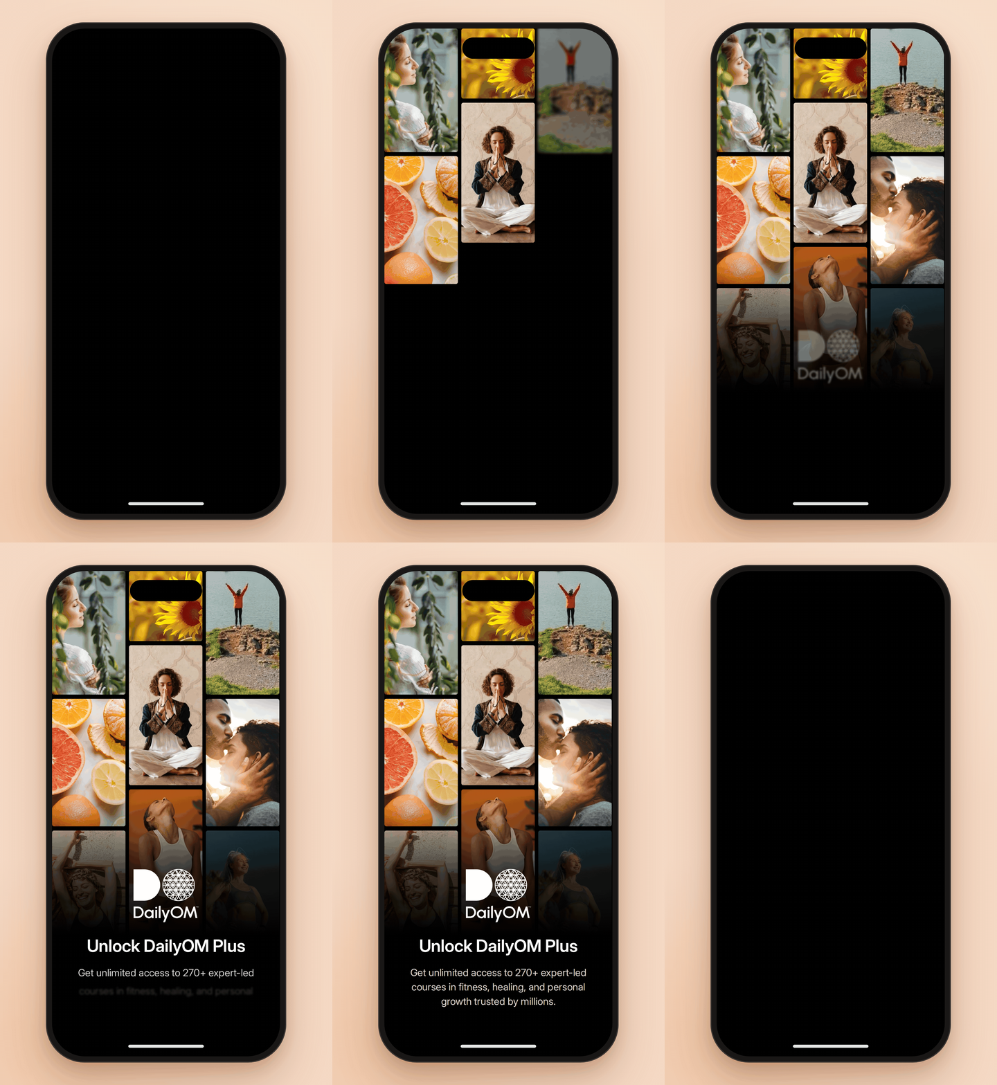
The paywall was one of the most important screens in the app, and one of the most explored. We tried at least four approaches: simple bullet points, a photo grid, a value-prop headline over a full-bleed photo, and a longer timeline with reviews and an FAQ.
The grid won. It shows the breadth of DailyOM at a glance: yoga, food, relationships, sunlight and quiet moments, all in one frame. Then came the real work, as always with this brand: refining the images. A grid is only as calm as its weakest photo, so we swapped, cropped and rebalanced tiles until warm, real people and sunlit nature sat comfortably together, in both light and dark mode.
Search, filters and bookmarks
Not every decision was a big one. Search, filters and bookmarking were smaller features, but each got its own round of discovery: pen-and-paper sketches first, then references from Apple’s own apps, then DailyOM’s styling on native components.
Search shows it best. The empty state became a gentle prompt, “What Do You Seek?” Results appear as she types, by course title or author. Bookmarks and progress sit right in the list, so she can tell at a glance what she’s already started. And the no-results screen borrows Apple Music’s calm, native pattern instead of inventing a new one.
The Result
Longtime members kept everything.
Web purchases carry over into My Courses, so the people who built DailyOM over twenty years didn’t lose a single course moving to mobile.
A new way to subscribe. DailyOM Plus launched with two paywalls: one in onboarding for existing members, and one at the moment a lesson opens. Built on RevenueCat, a new paywall experiment now takes about a week instead of about six, so the team can keep testing prices, offers and copy without waiting on a release.
What this project led to
It made the team bigger, and better.
DailyOM was the first time two Ziff Davis brands built one product together, and it gave us a playbook for the collaborative projects that followed. It also let me build out a real design team. Adam Moss, who reported to me and led the Android design, became our Android design lead, and with dedicated platform ownership we started shipping more efficiently across the board.
The native foundations we set up here, platform palettes, system type and the line between branded and native components, became the starting point for rebuilding the Lose It! design system on iOS and Android.