
Challenges
I direct the design of the app Apple uses to keep its own employees moving.
-
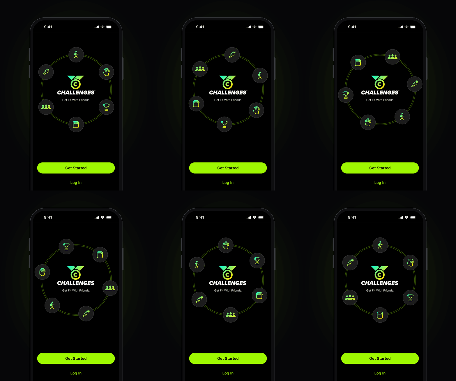
Challenges is Everyday Health's team-fitness app: goals, points, teams and a leaderboard, built on Apple Health. Apple runs its internal employee fitness challenges on it, which makes Apple both our biggest customer and our design standard.Since 2023 I've directed every major release: the Mindful Eatwell Challenge on Apple Watch, the iOS redesign in the Apple Fitness idiom, Daily Tip, the yearly Mindful challenges, the Liquid Glass reskin of the whole app, and the 2026 challenge celebrating ten years of Apple's Activity rings. It's one of the brands I manage, and it's still going.
-
Design Director. I own the direction, the design side of the Apple relationship, and the standards. Product: Taylor Smyrnos. Design: Silu Manandhar, who also built the Lose It! design system with me. Engineering: the Everyday Health team.
-
This one isn't measured in conversions. Challenges is an investment in our brand family and in a long relationship: Apple has run its employee fitness challenges on it since 2023 and keeps coming back, with a new one every year. The last one had 596 teams. For a design team, it's also the highest bar we work to: our work has to sit next to Apple's own on Apple's own devices.
The Challenge
Apple's app, on the hours left over from Lose It!
Time. Our main priority is Lose It!: that's what brings in the money, and that's where the team's hours go. Challenges is the small project on the side. But it's the one Apple runs its employee fitness challenges on, and we value that collaboration too much to let it look like a side project.
So every feature and project here is designed to be as efficient as possible: reuse before invent, borrow Apple's idiom instead of building our own, ship the smallest thing that still feels native on Apple's devices. Fewer decisions, made earlier.
Less time isn't less craft. It's knowing exactly where the craft goes.
Timeline
2026
Apple Rings 10-year anniversary challenge
Mindful challenge 2027
2025
Liquid Glass reskin
Apple Watch modernization
Mindful challenge 2026
2024-23
Minor features & Bug fixes
iOS redesign
The Design Pillars
Native, down to the glass
Apple runs its employee challenges on our app, on their own devices, so "close enough" isn't native. When Liquid Glass arrived we rebuilt the whole app in it, Apple Watch included, and took the Fitness app as the reference.
Privacy is the feature
Health data, employee data, one company's people. Privacy mattered to Apple's team from day one, and we designed to it: check-ins that ask one question and store one answer, teams that share points and nothing else.
Design for behavior change
A challenge is only a leaderboard until someone's day changes. Every feature earns its place by making the good thing easier to do: one-tap check-ins on the wrist, a tip a day, rings you can close.
Project 01 — Liquid Glass.
Overview
At Ziff Davis I manage a portfolio of apps, and when Apple shipped Liquid Glass the job wasn't one app, it was all of them. In parallel with taking Lose It! to Liquid Glass, we had to do the same for Challenges: take our old, tired-looking app and reskin it in Apple's new material.
First stop, as always, Apple's own apps: Fitness and Health, screen by screen, for the brand, the color and the layouts. For Liquid Glass itself we worked from Apple's documentation and the iOS 26 system updates. Two changes carry most of the weight: the glass, the layered, translucent surfaces of iOS 26, and the color. We moved off our yellow to a vibrant green, closer to Apple Fitness.
Tradeoff
Every hour on Challenges was an hour off Lose It!, the app that pays for the team. Time was the constraint, and engineering and design hands with it. It got to the point where my manager, Patrick Rills, VP of Product, stepped in and coded the app himself. We shipped it. That's the tradeoff you make for a customer like Apple.
The Result
Not measured in new users. Measured in Apple coming back.
The reskin didn't move a download chart, and it wasn't meant to. It went into something harder to win: our relationship with Apple. We asked to modernize, we shipped it on Apple's own design language, and the collaboration is still going. It also went to the people on the other side of the screen. Every challenge is someone on a health journey, and a team trying to beat another team. An app that looks like it belongs on their phone takes both seriously: the goal, and the competitive spirit that gets them to close their rings one more day. That's what we reskinned it for.
Project 02 — Mindful challenge with Apple.
Overview
Once a year Apple runs its Eat Well challenge on Challenges, one of the two global employee challenges it contracts us for, and it's our main design collaboration with them. The mechanic is simple: form a team, compete, and log two things every day. What you ate, in servings of fruit and vegetables, and how you felt about it. It's mindful consumption in its most practical form, the same idea underneath Lose It!, our sister brand: notice what you eat, and the rest gets easier.
Three screens collect the emotions, one for each skill: Sense your hunger before you eat, Savor while you eat, and note your Satisfaction after. Each one is a single tap on an emoji, with a short reflection underneath. A mini onboarding teaches the rules before the first check-in.
Tradeoff
Working with an outside team is always the hard part: getting feedback on the designs in time, and setting expectations on both sides about what's possible. On this one the constraint was engineering. We had limited engineering resources, so the design had to do more with less: reuse the check-in pattern three times instead of building three different screens, and keep the onboarding to three.
The Result
Apple keeps coming back, and wants more.
In 2026 the Eat Well challenge drew a major share of Apple's employee base, from executives to retail stores, all logging what they ate and how they felt about it for a month. Apple has renewed its challenges with us for more than ten years, and it wants to keep going. That's the number I care about most: a company that holds everything to its own standard chose, again, to run its people's wellbeing through our app. The next one is already in design.
Project 03 — Apple Watch.
Overview
Apple Watch is one of Apple's flagship products and the center of the Close Your Rings Challenge, and our watchOS experience was overdue for attention. Alongside the phone, we rebooted the Mindful check-in on the wrist and fixed the Watch app for Liquid Glass: one color per metric, one big number per screen, and a single tap from the glance to the action. In Apple's 2026 survey, the Watch complication was the single most-used feature of the challenge, cited by about 65% of respondents.
Tradeoff
There was almost no documentation on taking a Watch app to Liquid Glass. Apple's guidance was written for the phone, so we had to find out for ourselves how the material behaves on a small, round-cornered screen. Every hour spent investigating was an hour not spent fixing. We traded some polish on the edges for a clear answer on the core screens, and shipped those right.
The Result
One product, on two screens.
The Watch and the phone finally look and behave like the same app. People can use the Watch as a second challenge tracker: glance at their points, log a fruit or a mindful check-in, nudge their team, without reaching for the phone. The challenge now lives where the rings do.
Project 04 — Apple Rings 10-year anniversary.
Overview
In 2025 Apple celebrated ten years of the Activity rings, and we built a special challenge with them to mark it. Branding was the feature. We started where we always start, with Apple's own assets: the Global Close Your Rings Day award, the Close Your Rings page, the rings as light. Then we added the one thing an anniversary needs, a metal. Gold framed the 10 mark, the challenge card on Home, the intro page and every button, and we explored it many ways before landing on the final.
Tradeoff
For once, there wasn't one. We had the time and no hard constraints, so the tradeoff we usually make, speed against polish, didn't apply. We spent that freedom on exploration: more versions of the gold than any other challenge got.
Met with enthusiasm inside Apple.
The anniversary challenge landed the way we hoped: Apple's own people, the ones who closed those rings for ten years, were excited to join it. A celebration of their product that felt like theirs.
The Result
What this project led to
It got me moving.
Four years of designing the app that gets Apple's people to close their rings changed how I move, too. I started doing more fitness and more sports, and I got competitive.
It also brought me people. Marilyn, who I met at Zumba at the YMCA, forever inspires me: she shows up, she moves, and she smiles through every class. Friendships like hers are the part no leaderboard measures.