
SPARK + REBEL
One sustainable brand, every hat: I directed it, made the clothes from what already existed, shot them, wrote the site and sold them — then listened to the buyers and rebuilt it for the people who perform.
-
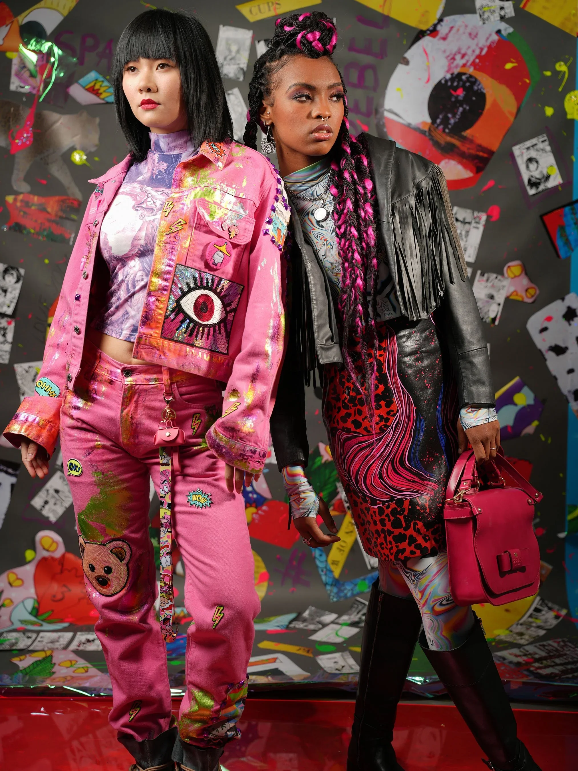
SPARK + REBEL started in 2022 as the fashion label under Sparkpick — one-of-one streetwear, upcycled leather, modular pieces, digital collections on DressX. Four physical collections and two digital ones later, the customers told me who the brand was really for. Not the eco-shopper I'd drawn in the personas. Dancers. Musicians. Costume designers pulling for film and music video.
So in 2026 — recently, and deliberately — the brand turned to face them: a wardrobe archive for the screen, organised by character instead of category, with a pull service for productions. This page is both halves — the brand I built, and the one it became.
-
Founder, creative director, designer. Brand strategy, identity, garment design and art direction, photography direction, e-commerce and the 2026 website — which I vibe-coded myself in Claude Code as a single HTML file, fourteen versions deep.
-
Four physical collections and two DressX digital collections. A 500-piece archive, every piece one of one. 10+ performers dressed — dancers, musicians, wardrobe for music video and film. 5★ across how many sales on Etsy and Poshmark.
The Challenge
The brand I designed and the brand people bought were two different brands.
On paper, SPARK + REBEL was sustainable fashion for the self-expressive: Harajuku, punk, modular, upcycled. In the order history, it was something else. The buyers were dancers and musicians who needed to be seen from the back of a room, and stylists who needed a jacket with a story by Thursday. My pieces were turning up in music videos and on film sets — and I'd built a website that talked about carbon offsets. At the same time, making new garments in California cost more than the market would pay for them.
Two problems, one answer: stop making for an imagined customer, and start curating for the real one.
The Brand Pillars
Logo
The wordmark stays the same as in 2022: SPARK + REBEL, with the "+" drawn as a tall vertical mark and the last E flipped. Use it white on black. The "+" can be red on its own — that's the only color change allowed. No outlines, no effects, never on a busy photo.
Typography
One typeface: Avenir Next. Look titles are set in condensed capitals, like a film title. The tagline is italic. Small labels are capitals with wide letter-spacing. Body text is regular weight. No web fonts to load — it's built into the system.
Color
Three colors: black for backgrounds, red for one accent per screen (bright red for the mark, dark red for buttons), and bone-grey for text. Each look adds five colors of its own for its palette, but the three brand colors never change.
Imagery
Photograph the piece on a person playing a character, never on a mannequin or a white background. Backgrounds are saturated colour, collage or print. Archive tiles get a film-frame edge; moodboards get torn-paper edges. Motion is a slow crossfade, not a sliding carousel.
Brand voice
Short sentences. Say it directly, the way a stylist talks to a stylist. The brand line is art you can wear. Example: "Buy the pull or take it on memo. Once it's gone, it's gone." The two older slogans — "Wear Your Revolution" and "Be seen. Be heard. Be you." — are retired.
The piece
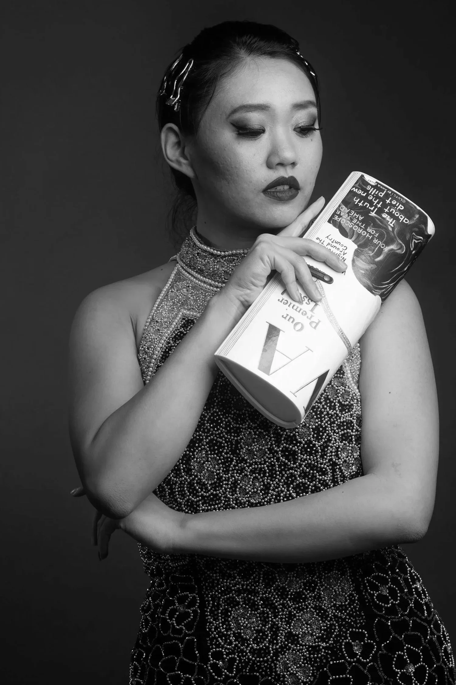
Every piece ships with its record: a spec card with measurements, era, material and what it was before, a hand-written hang tag, and a black tissue wrap with one red seal. The garment is the media — nothing we print should be louder than what it's attached to.
Part 1 — Building the brand
Decision 01 — The persona pivot: design for the people who bought, not the people I imagined.
Overview
The 2022 brand book had two personas, Kai the creator and Riley the rebel — creative professionals who shop with their values. Real orders came from performers and the people who dress them. I rewrote the personas from the order history, cut them to three, and gave each one the only line that matters: what they need the clothes to do.
Tradeoff
Narrowing the audience meant walking away from the general eco-shopper — the larger market, and the one I'd spent two years courting. I chose the smaller room where the brand was already wanted.
Decision 02 — The production pivot: from made-in-California to rescued.
Overview
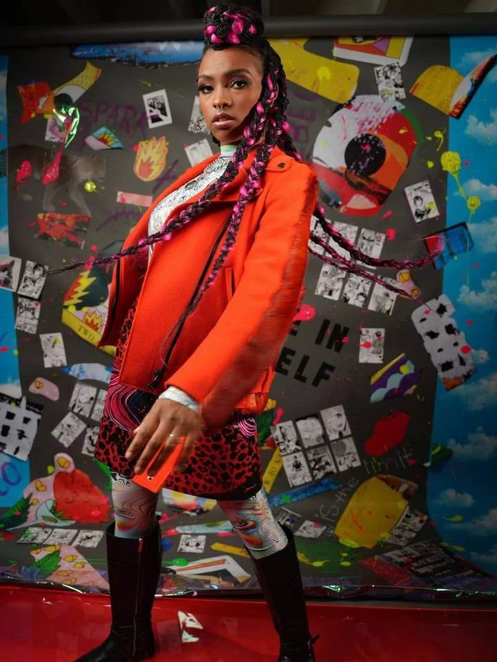
Cutting and sewing new garments in California priced every piece out of its own market: a jacket cost about $400 to make. A comparable jacket, rescued from the vintage stream and reworked by hand, cost about $30 to find — and came with a story I couldn't manufacture at any price. Then I watched Girlboss, and the answer was in the first episode: the value isn't in making the jacket, it's in finding it. The brand moved to rescued vintage and one-of-one rework — hand-painted leather, rebuilt denim, sequins with a past. Every piece now arrives with a history instead of a carbon offset.
Tradeoff
Vintage can't be restocked. A sold piece is gone, and the catalogue is never the same twice. That's a merchandising nightmare and, for this audience, the whole point — so the site says it out loud: Once it's gone, it's gone.
Upcycled, vintage, and rescued
Part 2 — The design
Decision 03 — The identity: keep the mark, change what it stands on.
Overview
The wordmark stayed — SPARK, the mark, REBEL. Everything around it moved from boutique to cinema: black ground, one red, bone type; condensed capitals for the looks so a title reads like a title card; a voice that sounds like a maker, not a store. The full system lives in the SPARK + REBEL brand book.
Tradeoff
A darker, quieter identity gives up the friendly retail energy that sold hoodies in 2022. It gains authority with the people who hire wardrobes — and they're the ones who buy ten pieces at a time.
Research first,
then the look.
Every branding project starts with research and inspiration. Before the logo, the palette or a single piece, I build the board: who we're dressing, who's already doing it well, and what it should feel like on camera. For SPARK + REBEL: the houses that gave fashion permission to go too far, the films where wardrobe carries the scene, our own shoots as the eight characters — and the Hollywood sign, because that's where the pieces are going.
Decision 04 — The website: from boutique to wardrobe archive, vibe-coded in Claude Code.
Overview
Instead of another Shopify theme, I wrote the site myself with Claude Code — one HTML file, no framework, no CMS, fourteen versions in three days. That let me design in the real medium: the looks index reveals a piece on hover, each look opens like a chapter (character, moodboard, five ways to play it, required viewing, palette, then the pieces), the archive shows spec cards, and productions get a three-step pull flow. Every decision was tested in the browser the same hour it was made. Then I handed the file to a developer as the spec, and we implemented it on WordPress.
Tradeoff
A vibe-coded prototype is a perfect spec and imperfect production code: the developer rebuilt it on WordPress rather than ship my file, so the site was built twice. Three days of designing in the real medium bought a brief no deck could match — and cost a second build.
The Result
The click was immediate. Orders went up, and the people writing to us changed — more stylists, more performers, more of the audience the rebuild was for. New partnerships followed. But the biggest outcome isn't on a dashboard: it's the connections, collaborations and friendships built making this brand — the photographers, performers and makers who are now part of it.
What this project led to
I built SPARK + REBEL to dress performers — and somewhere in the fittings, the shoots and the shows, I became one. Standing in front of the camera and on stage with the people I was dressing turned into the biggest professional milestone of my life: I started dance, then acting, then improv comedy, and wrote and starred in my own work. The connections made through this brand — photographers, performers, stylists — became the people I make things with now. It also turned a founder's opinion into a director's instinct: I don't design for a user anymore, I cast for a character. Next is where that went: Voices in Jessica's Head, my comedy series.