Google Projects
UX DESIGNER • VISUAL DESIGNER
Overview
Google will always have a special place in my heart—because it’s where I jumped from engineering to UX and never looked back. Over more than two years, I worked on four very different projects, each with its own unique challenges and rabbit holes. From cutting-edge experiments at Google ATAP to designing for Tilt Brush VR and Google Lens, all the way to core products like Gmail and People & Sharing, I got a crash course in designing for everything from futuristic tech to everyday essentials. Let me take you behind the scenes of this wild ride.
Pixel 4: Pokémon Wallpaper & Interactive App
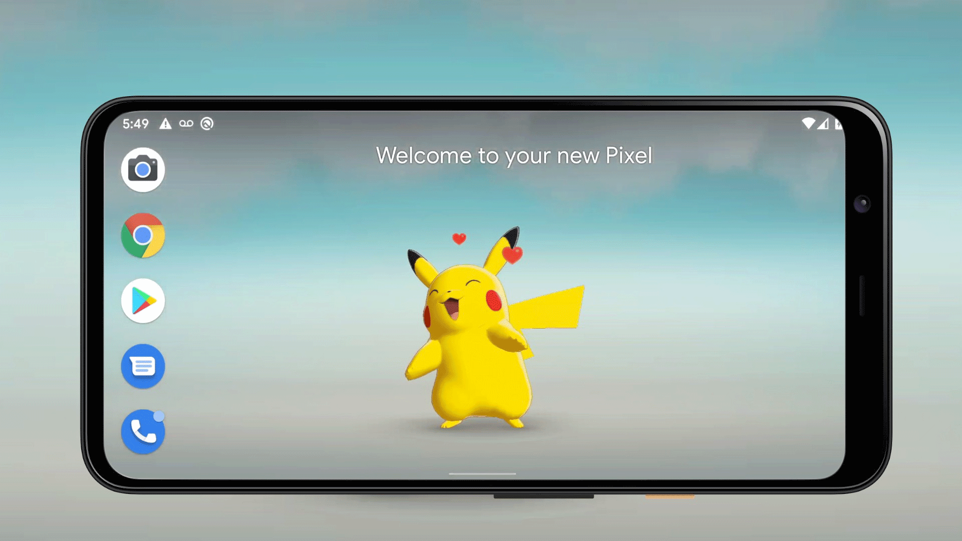
This collaborative project between Google ATAP and The Pokémon Company brought Pokémon to life through Pokémon Sidekick, an interactive live wallpaper, and Pokémon Wave Hello, a playful app designed exclusively for Pixel 4. Both products leveraged Motion Sense (Soli), a miniature radar chip capable of detecting precise hand gestures—turning simple movements into magical interactions.
As part of a small but insanely talented team (known for their Emmy-winning Google Spotlight Stories), I contributed to UX design, user interaction testing, and overall design feedback. My focus was on ensuring intuitive gesture-based interactions and refining the user experience through iterative design improvements.
Key UX challenges included:
Gesture clarity – Do users instinctively know what movements to make?
Pokémon behavior – Should they have personalities and act independently?
Time-based interactions – When should Pikachu wake up or go to sleep?
Balancing delight, usability, and seamless motion detection was at the core of the experience. The result? A charming, interactive Pokémon companion that responded to real-world movement—blurring the lines between digital and physical play.
Tilt Brush VR: Designing for 3D Creativity
Tilt Brush by Google reimagined digital art, allowing users to paint in 3D space with light. A favorite among VR artists and hobbyists worldwide, the app earned two Gold Lions for Innovation and Digital Craft at Cannes Lions in 2017, along with other industry accolades.
I joined the team for its final public release, stepping in as both a UX designer and QA lead, helping refine three major features: Camera Path, Google Drive backup, and Sketchfab support.
The Camera Path feature let Tilt Brush users plot paths around their 3D artwork and record cinematic fly-throughs—essentially turning static VR paintings into dynamic video experiences. Designing this feature was especially exciting because it merged two areas I knew well: filmmaking and UX. My background in film helped shape user mental models around shooting a VR scene, while my experience with Adobe Creative Suite tools like Pen and Path played a role in ensuring the feature felt familiar to digital creators.
The biggest UX questions?
How intuitive is it to create and manipulate Camera Paths?
Will users find it easy to adjust and delete anchor points?
How seamless is the video recording process?
To answer these, we conducted internal usability testing, uncovering key issues. Deleting and adjusting anchor points wasn’t intuitive, and creating a secondary camera path felt clunky. We tackled these challenges head-on, refining interactions to make the process as smooth and creative as the painting experience itself.
Working on Tilt Brush VR was a rare opportunity to design for a whole new medium of artistic expression. It wasn’t just about painting—it was about creating a natural, intuitive, and immersive creative flow in virtual reality.

People & Sharing: Unifying Google’s Contact Experience
As a UX designer on Google’s People & Sharing team, my challenge was to bring consistency to six core products that define how users interact with contacts across Google. These included:
Mobile products: Android Contacts, People Sheet iOS, People Sheet Android
Web products: Hovercard, Web Contacts, Web Companion
Each of these had been designed at different times, by different teams, with different UI patterns—which meant user experiences varied significantly. My role was to harmonize the UI, streamline interactions, and translate select products into Google’s latest design system, Material You.
Web Surface Misalignment Issues: People Companion & Web Contacts
Mobile Surface Misalignment Issues: Android Contacts, People Sheet iOS, and People Sheet Android
My goal was to create a seamless, consistent experience across these six products, ensuring users could navigate contacts effortlessly, whether on mobile or web. To achieve this:
I redesigned key products into a unified card-based format, enabling engineering to reuse components across different surfaces—saving development time and improving sustainability.
I transitioned multiple products to Material You, aligning user journeys across Android, iOS, and Web Contacts.
The new design system prioritized content visibility, helping users focus on the most relevant information while reducing cognitive load.
Android Contacts: Before and After Redesign
Redesigned Products: Web Contacts, Android Contacts, and People Sheet iOS by Google
Beyond the design impact, this work had real business results. After launching the Web Contacts redesign, our paid Enterprise 1-day active users increased by 40%, jumping from 213K to 301K.
At its core, this project wasn’t just about aesthetics—it was about driving engagement, improving usability, and setting the foundation for a more scalable, cohesive contact experience across Google’s ecosystem.
Google Lens: Visual Design
For this internal Google Lens research project, I designed “Postcards From the Field”—a series of small, engaging digital cards that distilled key user insights into bite-sized, visually compelling takeaways.

Instead of lengthy reports, these postcards were created to increase empathy and engagement among engineers, designers, and product managers by giving them a glimpse into real user experiences.
I developed 21 digital postcards, each highlighting a specific research insight, and also explored the UX of card delivery and viewing to ensure a seamless internal experience.
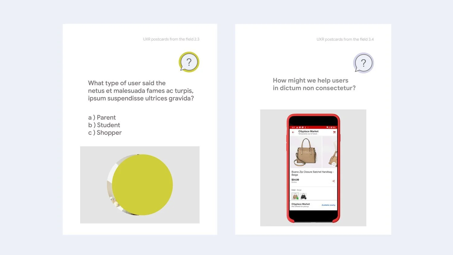
Different Types of User Prompts: Quiz (Left) and User Screen (Right). Placeholder Text Used for Confidentiality.

Front Side Layouts: Guessing User Screen (Left) and Quote (Center).

Branding Guide Designed for This Project
The response was overwhelmingly positive, reinforcing the value of visual storytelling in user research. By making insights more accessible, engaging, and actionable, this project demonstrated how design can bridge the gap between research and real-world product decisions.
Key Insights
From Google ATAP’s emerging tech to Google People & Sharing’s large-scale ecosystems, I’ve tackled projects where design meets complexity—whether it was refining gesture-based interactions, VR art creation, or harmonizing Google’s contact systems across six products. The biggest lesson? Great design turns complexity into clarity—making cutting-edge tech feel intuitive, natural, and engaging. Whether designing for VR creators, mobile users, or internal research teams, I’ve learned that seamless UX isn’t just about aesthetics—it’s about empowering people.
At Tilt Brush VR, I saw how design can shape new creative tools, turning 3D painting into an intuitive and immersive experience. At Google People & Sharing, I built a unified design system that streamlined interactions across web and mobile, reinforcing that future-proofing design is just as important as solving today’s problems. Across all projects, the common thread is this: the best design isn’t reactive—it’s intentional, forward-thinking, and built to create lasting impact.